How did I make my webpage? Well, it started with a dream and it evolved to a reality with a little help from the tutorial we started with in class. I essentially took what we did, seeing as we learned and utilized many things in HTML code and CSS, and changed what I wanted to fit my desired layout. By looking at my front page you can tell that I did not just take the exact layout of the tutorial because I did not need to. I used the same header and only a couple of other headers as well. I completely got rid of the paragraphs on the first page and moved them to my internal links (the ones titled cuisine, film, and percussion).
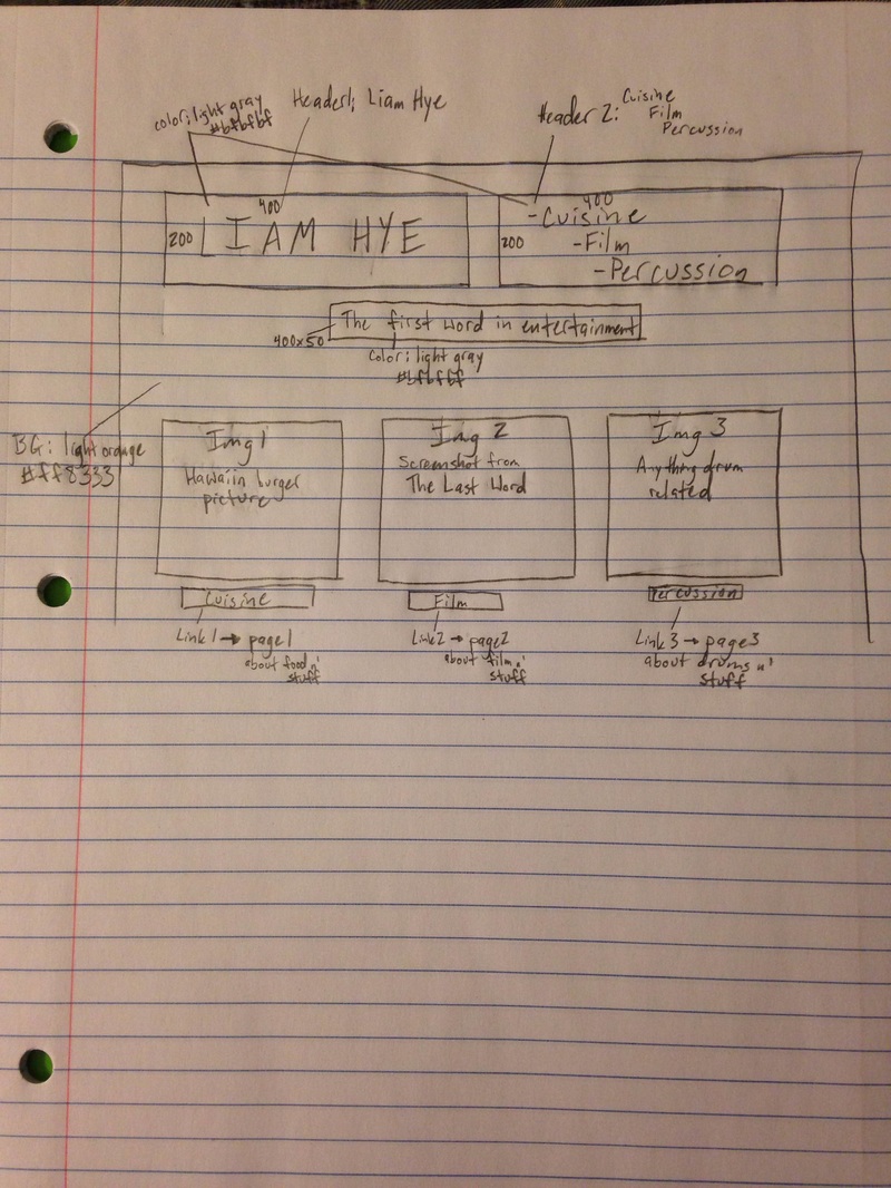
The biggest problem I had was positioning the pictures to where I wanted them to go. I got very lucky with the positioning of the pictures on the front page because I was messing around with the wrappers and float in the CSS code until I got them to line up in a fashionable way. The way my website is designed now is, in my opinion, better than the way I imagined it.
Some of the successes were putting in the videos on the film and percussion tabs. I was impressed that I figured out how to put a video in using the same kind of formatting and idea as inserting a picture. I created a “movie” file in the root folder and then transferred the film into that folder and followed the tutorial on the W3 Schools website for how to input a video into the code without embedding it through YouTube. Speaking of YouTube, my other success was embedding the video from YouTube onto my website. Luckily I did not have to do much other than copy and paste so I guess that could be anybody’s success story.
I think the main mode I used in my website design was the visual mode but I also dabbled in some aural modes as well. The visual aspect, to me, is the most important because if I were to just code everything in HTML and leave the CSS alone, the site would be incredibly boring. Instead of a white background and black text, I chose to do an orange background with a gray wrapper with black text. The two different colors behind the text bring out another depth that would not be there if I were to just leave the white background with the black text.
Audience: my intended audience is my classmates. I want them all to know who I am and where I come from.
Purpose: Almost the same reasoning as my audience. I want my classmates to understand me as a person and know what I like and love.
Context: The context of this project is a webpage. I created this webpage to entertain people and let them learn a little about me.
Author: I have established credibility with this site because I created it. I could have lied about what I like to do and make myself seem like a better, much cooler version of me but I chose not to because I think what I do is pretty cool.
Genre: The genre of this text is an introductory site which is similar and identical in genre to all the other projects that my classmates created.
 RSS Feed
