|
0 Comments
You feel like everything is going great! You have gone on a couple of dates, things have gotten pretty serious, and before you know it, you are boyfriend and girlfriend. The day after you make it “Facebook official” you get the news from your best friend, “Yo (hey) man (girl), I saw Kelsey (Brad) hooking up with another dude (girl) at that party last night…” (If you’re a guy read the italicized sentence. If you’re a girl, substitute the underlined words for the bolded words). Cheating. Hopefully it is something we do not have to ever go through but if you have experienced this in the past, all of our hearts go out to you. They are the love of your life before you learn of this disgusting act and then they hold a special place in your heart, a place for pure evil. The only other things located in this region are midterm exams AFTER spring break and stepping on Legos with bare feet. 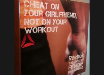 The purpose of this advertisement from Reebok almost tries to glorify the act of cheating and tells guys to . Clearly their audience is guys at the gym because it says, “cheat on your girlfriend…” because otherwise they would try to keep it gender neutral and say, “cheat on your significant other…” Obviously that is not the solution to this horrible advertisement but I am just saying if you are going to put out an advertisement, why not make it reach to both genders and not just one. The genre of this advertisement is gym rats; people (men specifically) who are constantly in the gym and who will see this every day. The same goes for the audience and context. The audience is men who go to the gym often and the context is fitness and recreational areas.
The only solution that I can think of is to just take it down. It is not necessary and it condones horrible behavior. If they really, really, really wanted to keep the advertisement up, then maybe, like what I said before, change the wording so that it reaches out to everybody and not just men in relationships. Maybe they can try reaching out to other people such as lonely college students, change the wording of the advertisement to something less bad, and go on with their merry day. I can see, “cheat on your math test, not on your workout” as being both comical and, in all seriousness, more important because what is going to matter more when you are sixty years old, that one math test you took your freshman year or the time you spent in the gym working out instead of studying*. *I do not condone cheating in an academic environment or any environment for that matter. It was a crisp autumn day in 2006 when my English teacher revealed to the class that we would be reading The Outsiders by S. E. Hinton. I am not much of a reader but this novel changed the way I read, write, think, and view the world. Not only was the novel influential but so was the film and the reoccurring symbol of a sunset. After finishing the book the inspiring 6th grade filmmaker in me convinced the teacher, with some help from my fellow students, to watch the movie. She set aside three class days to watch the film which put us way behind schedule with all the snow days we had already but it was not a concern of hers or mine. The book not only opened my eyes to what it means to actually enjoy a book but it also helped me as a writer when I was younger. I aspired to draw images in the readers’ mind like S. E. Hinton did in her novel with the sunsets. She barely said a word about the actual way the sunset looked but she left it up to the reader to imagine his or her own sunset and this idea is what really inspired and shaped me. When I write stories or poems or screenplays I leave a lot up to the reader. It is a risky approach in academic writing but I always support my case.  “It seemed funny to me that the sunset she saw from her patio and the one I saw from the back steps was the same one. Maybe the two different worlds we lived in weren't so different. We saw the same sunset.” When it comes to filmmaking, don’t even get me started on Francis Ford Coppola. The Outsiders was the first film of his that I saw but nothing compares to The Godfather but that’s beside the point. The Outsiders was my favorite film at the time and really got me in to making movies. I remember taking out the shitty family camcorder and gathering together some friends to make a really, really bad “movie” (I put that in quotations because I do not think it really qualifies as a movie but the young Liam was very proud of his work).
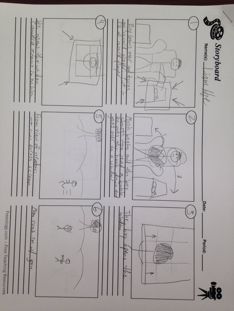
Sunsets. Holy guacamole, sunsets. These beautiful pollution oil spills in the sky changed my life as an artist both through words, music, and visual arts. Whenever I am writing I really try my best to paint an image in the reader’s head because that is what my teachers have taught me ever since, like, second grade. If you can make the reader see exactly what you saw, you’ve done it right. In music, whatever I am playing, I imagine something beautiful. My drum teacher in third grade told me this great advice and I have stuck with it ever since. In the visual arts world it is the perfect time to do anything: take pictures or film. Golden hour is the best. The beautiful golden color that sweeps over the landscape when the sun hits that perfect position above the horizon is flawless. The Window from Liam PhotograpHye on Vimeo.
Password: joeloverall
How did I make my webpage? Well, it started with a dream and it evolved to a reality with a little help from the tutorial we started with in class. I essentially took what we did, seeing as we learned and utilized many things in HTML code and CSS, and changed what I wanted to fit my desired layout. By looking at my front page you can tell that I did not just take the exact layout of the tutorial because I did not need to. I used the same header and only a couple of other headers as well. I completely got rid of the paragraphs on the first page and moved them to my internal links (the ones titled cuisine, film, and percussion). The biggest problem I had was positioning the pictures to where I wanted them to go. I got very lucky with the positioning of the pictures on the front page because I was messing around with the wrappers and float in the CSS code until I got them to line up in a fashionable way. The way my website is designed now is, in my opinion, better than the way I imagined it. Some of the successes were putting in the videos on the film and percussion tabs. I was impressed that I figured out how to put a video in using the same kind of formatting and idea as inserting a picture. I created a “movie” file in the root folder and then transferred the film into that folder and followed the tutorial on the W3 Schools website for how to input a video into the code without embedding it through YouTube. Speaking of YouTube, my other success was embedding the video from YouTube onto my website. Luckily I did not have to do much other than copy and paste so I guess that could be anybody’s success story. I think the main mode I used in my website design was the visual mode but I also dabbled in some aural modes as well. The visual aspect, to me, is the most important because if I were to just code everything in HTML and leave the CSS alone, the site would be incredibly boring. Instead of a white background and black text, I chose to do an orange background with a gray wrapper with black text. The two different colors behind the text bring out another depth that would not be there if I were to just leave the white background with the black text. Audience: my intended audience is my classmates. I want them all to know who I am and where I come from. Purpose: Almost the same reasoning as my audience. I want my classmates to understand me as a person and know what I like and love. Context: The context of this project is a webpage. I created this webpage to entertain people and let them learn a little about me. Author: I have established credibility with this site because I created it. I could have lied about what I like to do and make myself seem like a better, much cooler version of me but I chose not to because I think what I do is pretty cool. Genre: The genre of this text is an introductory site which is similar and identical in genre to all the other projects that my classmates created. 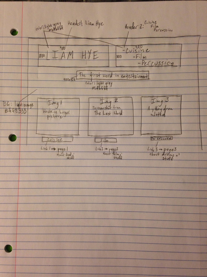 I am a visual learner. I could never sit still, let alone pay attention, in my English classes during high school. English and math were always my worst subjects simply because I could never pay attention due to the lack of visuals. Learning on the Internet, however, has changed my life because of all the pictures. I do not think there is a single web page that does not have any sort of visual element because without it, the website would be incredibly boring. Take any website, Facebook for example, and you will find at least twenty pictures before you even scroll down the page. This is the case for most websites. The truth website, an anti tobacco and drug campaign, has a picture on the home screen which emphasizes the purpose of their site and campaign. Their purpose is to reach out to teens to tell them that you do not need to smoke to be ‘cool’ or to fit in with the ‘cool kids.’ I remember growing up and watch their commercials on TV and they scared me to death. That one with the talking dog and then the commercial with that girl’s sister who looked like a sad Flat Stanley. When you first open up their website your eye immediately will go to the white font that says, “collaboration; truth x; nightmare; stop, drop, and listen” with a button below it that says, “check it out.” Right off the bat, their website is aesthetically pleasing with the contrasting black and white but not only does the text catch your eye, so does the picture of the dude’s face. The guy looks like he is probably in is early 20’s really appeals to their target audience as well. If the portrait of the guy on their homepage was a 65 year old woman, the website would obviously not be the same. 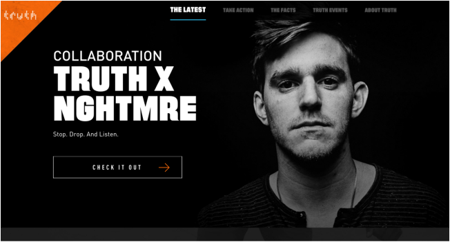 When perusing the page you can tell that the author is very credible simply because of the tab that reads, “The Facts.” After clicking on this option and scrolling down the page, you can see how credible this campaign is because the page has fact after fact with statistics and numbers. The website does indeed support these claims too because they are reaching out to their audience to try to help. The tab right before and after “The Facts” is there to help people in need. The one before reads, “Take Action” while the one after is “Truth Events.” The tabs were not just placed in any random order; there was a reason why they were put in this order.
The genre of this campaign site is hard to pinpoint because it could be sad or sorrow but at the same time be uplifting and courageous. The whole website is split 50/50 but has a fair ratio of the two which keeps the viewers emotions in line. The homepage is somber and direct while the “Truth Events” page is motivating. Long story short, the genre of this page varies with which tab you decide to travel to. Google gets all the blame. Sadly we revert to, “yeah I’ll just google it” and bam; the answer is right in front of your face. Unfortunately, Google has taken over the world of search engines and more so fast, readily available answers. Yahoo, Bing, ask Jeeves (rest in peace) have all been out numbered by Google but the cream of the crop and the ultimate dying resource: books and scholarly articles. Although the Internet now supplies the world with these resources, I do not think that people are using them to their full potential. When I sit down to start a research paper, I reach for a book instead of going on to the Internet because I feel as though I pay much more attention to the readings when they are in my hand rather than on a screen. In Nicholas Carr’s article, “Is Google Making Us Stupid?” he brings up many points backing my choice to read a book instead of an e-book. In the article he interviewed Bruce Friedman who is a constant blogger about computers and medicine. Bruce says, “’I can’t read War and Peace anymore,’ he admitted. ‘I’ve lost the ability to do that. Even a blog post of more than three or four paragraphs is too much to absorb. I skim it.’” I do not know about you, but I completely agree with this statement. It is so much harder to read an online article that is longer than a couple of paragraphs than to read the same article on paper.  http://www.velocityns.com/hs-fs/hub/106445/file-413729279-png/Blog_Images/Baby.Computer.Confused.png On a computer screen there are so many distractions whether that be YouTube, Facebook, or any other app or website that is easily accessible. Scholars from University College London published a study of online research habits and conducted that, “It is clear that users are not reading online in the traditional sense; indeed there are signs that new forms of “reading” are emerging as users ‘power browse’ horizontally through titles, contents pages and abstracts going for quick wins. It almost seems that they go online to avoid reading in the traditional sense.” I also agree 100% with this statement as well because people (especially college and high school students) cheat themselves by telling themselves that they have ‘read the required reading’ but in reality they cannot even recall the main character’s name or the purpose of the article. I have to admit that I am a victim of ‘power browsing’ simply because it is so much easier than actually reading the article online because I lie to myself and say that I understand what I just read. On the other hand, Steven Johnson argues Nicholas Carr’s argument with this brief segment at the end of his article that agrees with Carr but also provides his own insight on the problem which shows the pros AND cons of online text.
All things considered, online text can be very intimidating and distracting. However, we have been reading more (regardless of how much we have actually absorbed from whatever we are reading), we have been writing more, and we have actually gotten smarter as a generation. Growing up with an ever-adapting technological world, I must say that we have to embrace this change and, as my kindergarten teacher would say, “just go with the flow.”
|
Author: Liam Hye"'I'm kind of a big deal' -Ron Burgundy" -Liam Hye Archives
April 2016
Categories |
 RSS Feed
